My favorite getaway: renting a place, bringing a bunch of books (or better yet, discovering new books in the rental home), cooking in the Instant Pot, hiking, and playing the ukulele. I have apparently infected at least one offspring with similar interest in reading.
This week’s book? A story about a man living in England in the 1800’s, who ultimately is credited with what is modern day geology.
What’s cool, is the book cover actually unfolds into a large reproduction of the original map.
William Smith’s life is entirely relatable. He learns math and measurement, and has a keen eye for observation. As a young man, he helps develop a coal mine, and notices that the layers of earth, hundreds and thousands of feet down, seem to have a recurring pattern. Furthermore, as he gains experience digging canals, he sees the same patterns laid out across the region of Bath, where he is employed. Over a number of years, he is employed to dig canals, drain swamps, marshes, farms, all the while collecting rocks, fossils and developing his theory of Stratification (a term he coins).
I note that I am entirely a geologic novice, and Permian and Cenozoic terms come and go without lodging in my brain. However, Smith catalogues and builds ideas, and eventually a map of Bath. He links various strata with geologic eras, with aspirations of mapping all of England.
The trouble is, he’s a working man, traveling and helping companies and individuals. Furthermore, he (imprudently) maintains two offices and a home, that he cannot afford. His marriage to a mentally ill woman does not help, and his ideas lay dormant and unpublished for far too long. He DOES publish a fabulous map, sells 400 copies at “7 guineas each”, a disappointing non-recognition of his thousands of miles of travel and careful analysis.
This map is a massive work: it lays out across England, the layers of rock, coal, sandstone, chalk, etc, and the sequence of layers hidden below. In future years, it will end up launching the coal industry, farming, minerology, and influencing Charles Darwin.
In his adult years, he is fraudulently scooped, with others publishing his work as their own. He is denied admittance to the Royal Geological Society, snubbed because he is an orphan, and not born to high society.
With accumulating debt from his properties and failed business, he ends up going to debtor’s prison, losing everything, and then starting over, nearly penniless, living in rentals and traveling to do survey work.
Based on some chance meetings, he ends up getting recognition for his original solo research and work, FIFTY years later, and is finally recognized and rewarded, in his old age, as the Father of Modern Geology.
I can’t help but think that, so much of our lives are happenstance:
Whom you meet and connect with
How random chance connects you with a job you flourish in, or fail miserably at
What the local culture (class-based snobbery, or open-minded scientific inquiry) encourages or prohibits
How you develop useful skills, and work hard
How you see that others may not; what do you do with that knowledge
How you personally persist past obstacles, or succumb to pressures
CMIO’s take? This could have been a story of any scientist, any informaticist, any CMIO. This could have been MY story. And that’s what the best books are about.
Coming out of the tree-line, noticing the bright moonlight, we shut off our headlamps, casting the trail in an eerie black-and-white moonscape. We hiked by moonlight!
Quandary Peak, left, dominating the Breckenridge valley.
Quandary, for many Coloradoans, is just another one of those 53 peaks in Colorado over 14,000 feet in elevation. For me, however, it was a daunting collection of challenges posed by my college-aged kids. Would I get up at 2:45am to attempt to summit at sunrise? Would I know how to hike in darkness with a headlamp and not trip and fall? Would I keep the pace? Would I tumble off the wind-blown trail on the way up?
Quandary Peak is apparently one of the easier Colorado 14’ers to hike; only 3 miles from the trailhead to summit. How hard could it be?
At 2:45am, not a lot of cars on the road to the Quandary trailhead, up near Breckenridge, about 2 hours from Denver.
Hiking in the middle of the night, with disappearing trails, steep rocky steps and tree roots galore, is … trippy? exhilarating? disorienting? All of the above.
Hiking with a headlamp is surprisingly do-able (especially with the adrenaline of: am-I-going-to-survive-this energy).
Hiking with a headlamp is also highly claustrophobic, in that your entire world is the stomp of your boot, the clatter of your hiking poles, the next visible tree, the next rock, the next chance to trip in your faint circle of light.
About 4am, coming out of the tree-line, noticing the bright moonlight, we shut off our headlamps, casting the trail in an eerie black-and-white moonscape. We hiked by moonlight! This distracted me from the gusting, bone-chilling winds and the constant scramble over the rock fields. Nope, don’t have a camera that can capture this. But, next best thing (below):
Stars, the son, and the hint of sunrise. Pre-dawn scramble. Before the madding crowds.
Pre-dawn gloam in solitude, then blazing sun on descent, increasingly crowded.
About 530am, a purple, then green, then orange glimmer of sunrise to the east. Interestingly, the rocks started to glow orange UNDERNEATH, while faintly white on top. Is this what sunrise hiking is like? Never, have I ever…
Imagine: much darker, and somehow, the rocks glow orange underneath…
About 630am, after some shifting clouds, orange crepuscular rays burst through and the entire rocky ascent turned brilliant orange, moonlight banished. 4 liters of water disappears fast on a constant upward climb at 11,000 then 12,000 then 13,000 feet. So do snack bars and ham and cheese sandwiches.
Summit! about 7am. How could 3 miles take 4 hours? In hindsight: donning and doffing gear. Frequent gasping-for-air breaks (disguised as water breaks). I have no idea how Everest climbers have base camp far above 14,000 feet. Even acclimated to 5000 ft altitude in Denver, the additional elevation is tough on the lungs, heart, brain.
The US Geological Survey marker, 14,200 ft. Quandary Peak.
The timing of our climb, on a Saturday morning starting around 3am, was good; few people on the trail, and at our summit, we were among the first 10 people there, taking pictures. The descent, however… Well, lets just say, the photo below was about 8am. Within the hour, we saw hundreds of other peak-aspiring hikers on the narrow trail.
Rocks, and a cool ridgeline hike.
I’m thankful of active offspring who invite me along on such adventures. I’ve summitted 3 peaks that were 14’ers: Gray’s and Torrey’s, and now Quandary. Today I vow that this is my last 14’er: no need to punish this body any further.
On the other hand, I said the same after Gray’s and Torrey’s, two peaks side-by-side and commonly done on the same hike. I made the mistake that day of not bringing hiking poles. The descent, not the uphill, was my undoing: near the end of the hike, my right knee was so swollen and painful that I ended up keeping the knee straight and just swinging it outwards to take a step forward. In our family, we call that the “Pinocchio leg” for somewhat unclear reasons.
Quandary summit with daughter. The Rockies go on forever, it appears.
My main goal this trip: 1. Survive. 2. Use hiking poles to aid descent and avoid Pinocchio leg. 3. Blog about it. Success!
Well, it is time to update my resume. It has been a year, I have failed at more things. I’ve read more failure resumes, and I like some of the newer ideas, for example, listing your NON-skills. I’ve added mine.
One idea for brave souls willing to try, is to submit both your Regular CV / resume AND your Failure resume to your next job interview. Here are 1 page versions of mine (REGULAR resume – 1 page / FAILURE resume – 1 page).
And, wouldn’t you know, the most popular post on this blog, after 3 years of weekly writing on aspirational topics in informatics?
I love some of the writing out there on Failure Resumes:
Stanford Engineering: “come to terms with the mistakes … made along the way and … extract important lessons”
Forbes: Of 10 job applications, received 0 responses to traditional resume, but 8 responses for a traditional resume PLUS a failure resume.
Inc.com: why to encourage your employees to make a failure resume.
Even Einstein struggled: a scientific paper on how describing Einstein’s struggles to science students increased students’ hopefulness and engagement with science class.
ScienceAlert.com: A CV of failures is an entertaining and instructive read
CMIO’s take? I’ll be teaching an Informatics Leadership course soon, and will expect all our participants to write a one-page Failure Resume. Join us!
What I love about working in an academic health center is the luxury of being surrounded by people smarter, and more hardworking than I am. Here are Drs. Portz and Lum analyzing our data on the capture of patient’s Advance Care Plans – ACPs (including the Medical Durable Power of Attorney MDPOA) and other documents online via our patient portal.
We believe we are among the first in the country to offer the ability for patients to complete this online and designate a medical decision-maker in the event of their incapacity. Furthermore, we now accept photos of documents (easy and convenient via our patient portal app integrated with a smartphone camera — hooray modern tools for modern medicine) into the patient chart, and can see signatures, names, contact information, and details of MDPOAs, Living Wills and other ACPs.
And, during the anxieties of the pandemic, we had a significant uptick in patients completing the MDPOA and uploading images.
CMIO’s take? Another publication for our smart colleagues — good. Better patient care — great.
This is a great thinking piece from the New York Times. A ghost kitchen is a trailer set up in a parking lot, with chefs cooking dishes from restaurants, sometimes from 3-4 different restaurants. This can result in serving meals in the parking lot, or setting up for local delivery AS IF delivered from the main restaurant. This solves the problem of underemployed chefs at restaurants with inadequate social distancing seating, or restaurants that have had to remain closed for some reason.
Observations:
Placing ghost kitchens in parking lots leverages old spaces
Ghost kitchens emphasize hyperlocal location
Ghost kitchens are thriving during the pandemic
Ghost kitchens leverage internet tools: apps, A/B testing, analytics, and allows nimble innovation, recombination, creativity, disruption
Read the article, and come back here to think with me. What could healthcare learn from Ghost Kitchens? We are already seeing the beginning of disruption in healthcare: the use of telehealth visits with patients has increased the flexibility of patients and providers by removing geography as a constraint (in some cases). What could A/B testing, or analytics do to further serve our patients in a high-quality, personalized, lower cost way?
CMIO’s take? Sometimes, you have to look outside your usual work-sphere to get the best ideas. Sometimes you have to be willing to disrupt yourself before someone else gets there first.
Thanks to a great team of collaborative physician and nurse informaticists and our broader community of brilliant clinicians. We are happy to share our many uses of informatics in response to the Covid-19 crisis and hope that some of these findings are of use to other clinicians and health systems.
The article is open access, linked above. DON’T MISS the 11 supplementary online-only files with lots of details of “How we built this.”
CMIO’s take: these are the moments that make us proudest; being able to share the work of colleagues on the international stage in the service of improving patient’s lives, improving clinician lives, and in the advocacy for practical, clinical informatics.
It is fascinating, inspiring (and disappointing) to see effective responses to the Covid pandemic from other countries. Great partnerships and effective connection of governmental leadership, industrial production, and healthcare information can combine to combat the pandemic.
Taiwan has had only 446 cases and 7 deaths, for 24 million residents, since the start of the pandemic, despite their proximity to, and the frequent travel and many flights to and from China.
One my good colleagues Dr. Patrick Guffey turned me on to this website, that takes publicly available Public Health data and turns it into a graph projecting the current R(0) or infectivity rate, per state. I have found it to be compelling, and it reflects what we are hearing in reports from various states.
Consider adding this to your usual litany of sites monitoring the pandemic. I come and refresh my website view each day.
The Covid-19 pandemic is still quite uncontrolled in the US.
In this post, we’re going to walk through an analysis that was conducted by the UCHealth data science team looking at “leading indicators” that could help us to plan for a coming spike in COVID-19 inpatient hospitalizations before we actually see an influx of bed demand.
Perhaps, if we start to see more patients reporting a cough, fever, chills, and other flu symptoms, we would expect that this may indicate a growing spread of COVID-19. However, can we actually use the prevalence of these symptoms to predict how many ICU beds will be needed for COVID-19? What about less common symptoms of COVID-19, such as loss of smell or taste, that have been shown to be more predictive of COVID-19 infection?
While this may sound like a relatively straightforward question, there are a number of confounding effects that make it difficult. The above graphic shows the number of patients making an outpatient or virtual office visit due to a fever. As expected, there is a general downward trend as the seasonal influenza season subsides. However, there also appears to be a “spike” in reports of fever in early March in our Northern Colorado geography (orange line). Could this spike be quantified for future predictions?
Defining a “symptom” in our Epic electronic health system is complex. For example, symptoms can be documented as the “reason for visit”, but a medical assistant may or may not choose to report all symptoms as the visit reason. Besides “reason for visit”, our Epic team has developed a COVID-19 symptoms checklist that screens patients at check-in (completed by front desk staff). This list was expanded substantially in the midst of the epidemic based on new evidence (for example, loss of smell). The consequence is that we saw an increase in reporting of these symptoms in April, due to the new data fields, while our actual number of COVID-19 inpatient cases was declining. In short, there is a significant amount of noise to parse through before arriving at a prediction we can trust.
How did we go about identifying the signal from the noise? Knowing that there was no “right” answer, we tested different approaches. I’m going to focus here on the most recent modeling attempt that we have found to be most insightful. We started with the premise that the correlations between our independent variables (reported reason for visit, reported COVID-19 symptoms, and documentation of ICD-10 billing codes indicative of confirmed or potential COVID-19 infection) and our dependent variable (number of COVID-19 inpatient hospitalizations) would change over time due to trends in seasonal influenza and introduction of new codes/data elements in our EMR system. We therefore constructed separate linear regression models for the months of March (when the epidemic hit and we did not yet have IT system capabilities for tracking many symptoms), April (when COVID-19 cases hit their peak and then declined, accompanying a ramp-up in new IT system capabilities), and May (something of a “steady state” when seasonal influenza had passed and no major IT updates were made regarding COVID-19 symptoms or billing codes).
We wanted to test a large number of independent variables, and therefore chose to use a linear regression method known as LASSO regression instead of the traditional OLS modeling technique. LASSO regression introduces a regularization parameter that penalizes large coefficients in the model. Instead of optimizing to minimize prediction error, the model minimizes the below cost function:
Y: Dependent variable
X: Independent variable
β: Regression coefficient
λ: Regularization parameter
n: Number of observations
p: Number of independent variables in the model
In plain English: we reduced the complexity of the model and thus reduced the chance of spurious correlation or the influence of random “noise” in the data.
Our independent variables were reported outpatient symptoms and diagnoses in the seven days prior to the index date, and our dependent variable was the number of COVID-19 hospitalizations in the seven days after the index date. For example, on May 1 we fit the numbers of reported symptoms and documented ICD-10 codes from the prior 7 days (4/24-4/30) to the number of hospitalizations in the next 7 days (5/1 – 5/7). An astute reader will note that our modeling approach violates one of the tenets of linear regression modeling in that the observations are not mutually independent, but rather a time series. To mitigate this issue, as well as the small number of observations in a given month, we used a procedure drawing bootstrapped samples from each month 100 times, and for each sample, using a 5-fold cross validation process to determine the optimal regularization parameter, fit a LASSO regression model. A bootstrap sample is a random sample of the same size as your original data drawn at random with replacement from the original data, so in some samples data points for 5/1, 5/2, and 5/3 will all be included, some may only include 5/1, and some may include none of those data points.
Once again giving a simple English translation for those less interested in the modeling approach: we introduced some randomness to our data to give ourselves better confidence in our estimates of the linear correlation between each variable and our outcome of number of future COVID-19 hospitalizations.
The below table summarizes, by month, the average correlation coefficient from all of the LASSO regression models fit to bootstrapped samples of data from that month, sorted in decreasing order by the value in May. Please interpret the nomenclature as follows:
reason_visit: Indicates the variable is the reported reason for visit in an outpatient or virtual encounter
symptom: Indicates the variable is one of the COVID-19 symptoms selected from a checklist by clinicians at the beginning of outpatient/virtual encounters
icd: Indicates the variable is documentation of an ICD-10 code referencing confirmed or suspected cases of COVID-19
Variable Name
March Coefficient
April Coefficient
May Coefficient
reason_visit_COUGH
-9.80977
1.995882
7.786421
reason_visit_FEVER
-0.73825
0.487601
2.66054
reason_visit_CORONAVIRUS CONCERN
1.167884
-0.16012
2.399324
symptom_Fever
-0.52706
0.553718
0.626149
reason_visit_SHORTNESS OF BREATH
0.716685
0
0.599447
icd_B34.2
3.006547
0.297723
0.311514
symptom_Vomiting
0
-1E-15
0.22527
symptom_Diarrhea
0
0
0.179083
symptom_Shortness of breath
0.241053
-0.01326
0.134918
symptom_Cough
2.25537
0.100087
0.042621
icd_R68.89
-0.42723
0.790427
0.020276
icd_Z20.828
0.254416
-0.10133
0.002899
symptom_Red eye
0
0
0
symptom_Loss of smell
0
0
0
symptom_Rash
0
0
0
symptom_Joint pain
0
0
0
symptom_Sore throat
0
0
0
symptom_Bruising or bleeding
0
0
0
symptom_Weakness
0
0
0
symptom_Abdominal pain
0
0
0
symptom_Loss of taste
0
0
0
symptom_Muscle pain
0
0
-0.10438
symptom_Chills
0
0
-0.15124
symptom_Severe headache
0
-0.53023
-0.16017
icd_U07.1
0.253596
-3.47782
-0.24094
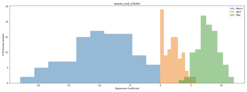
The strongest positive correlation with future COVID-19 hospitalizations in the month of May was “cough” as the reason for visit. At first, the trend in this correlation over time seems counterintuitive. Why would we see such a strong negative correlation in the month of March but a strong positive correlation in the month of May? Well, a reasonable hypothesis has to do with the ramp-up in COVID-19 testing coinciding with the end of the 2019-2020 seasonal flu. In March, we saw an overall decline in patients seeking outpatient care for a cough, likely due to both the end of seasonal flu and social distancing keeping patients from seeking treatment at medical facilities, while we simultaneously initiated widespread COVID-19 testing at our inpatient facilities and saw a rapid rise in confirmed cases. In May, by comparison, there was no noise from the seasonal flu influenza and no significant backlog in testing to ramp up.
We can also look at the distribution of the regression coefficient for the cough variable in our bootstrapped samples to better establish our confidence in the value. The below histogram shows the distribution of the coefficient across all 100 bootstrapped samples for the months of March (blue), April (orange), and May (green). Notice that for a large number of samples from March and April, the coefficient is near 0, while for the month of May it ranges consistently between 5-10. What does this mean? It means that a few data points in March and April are likely having a disproportional impact on the estimate of the linear correlation, while the correlation in May is more consistent regardless of which dates are sampled.
Examining the scatterplot for the month of May, we see that this linear correlation does appear quite consistent across the time period.
After all of this analysis, what are our big takeaways? Can we take our regression model for the month of May and start using it to predict bed demand? Unfortunately, this would be unwise. One month of data is too limited a timeframe for us to be confident in our model. While we see a significant correlation between patients seeking treatment for a cough and inpatient COVID-19 hospitalizations in the month of May, both variables declined over the majority of the timeframe. We would feel significantly more confident in our model if we observed a spike in inpatient hospitalizations preceded by a large number of patients reporting in outpatient settings with a cough, as opposed to the continuous decline. Hopefully, this never happens, but we believe a second wave of COVID-19 infections is very probable by at least next Fall or Winter. Our plan is to continue to update our model with new data, potentially including new data sources such as patient engagement with our Patient Line call center resources or Livi chatbot feature, through the next wave of infections and observe performance before deploying to assist in the management of hospital resources.
I forgot about my father’s memory and neurology clinic visit even though I had promised to go down to Denver with both of my parents to help them navigate the complex world of healthcare four months before. A lot changed in those four months, most notably COVID-19 swept across the world and made its way into the US. The pandemic placed my aging parents at a greater risk if they contracted the virus while traveling from Fraser, Colorado to Denver and my work schedule was beyond capacity as I added Federal and State COVID-19 reporting coordination to an already full project portfolio. How could a take a day and a half off work? How could my parents stay safe?
Telehealth and Rural (Mountain) Living
I decided to move on from my first health care job in neurophysiological monitoring to acute care in 2011. I also wanted to move to the mountains of Colorado. My parents already moved from Colorado Springs to Fraser, just outside of Winter Park, Colorado. Yampa Valley Medical Center brought me on as a quality analyst before they were part of the UCHealth system. After moving to Steamboat, I realized how remote and isolated Steamboat Springs, Colorado was from Denver and the other “Front Range” cities in Colorado. Here are some fun facts about driving from Steamboat for medical care:
Steamboat Springs to University of Colorado Hospital and the Anschutz Campus
169 miles
3 Hours and 10 minutes if traffic is good
One major mountain pass (or two if Eisenhower Tunnel is closed)
Steamboat to Poudre Valley Hospital
159 Miles
3 Hours and 21 minutes if traffic is good
Two major mountain passes or the choice to leave Colorado, go to Wyoming and drive back into Colorado so you only have to deal with one major mountain pass (adding on 30 more miles)
Many specialists come up to mountain communities on a rotational basis. However, this may be once a month and possibly less frequent. Telehealth is the obvious stop-gap for patients in rural and mountain communities that need specialized care. A barrier to telehealth visits as Dr. Lin has mentioned in his blog has mostly been the providers. However, with social distancing and with CMS lifting restrictions on reimbursement for telehealth, providers quickly adopted telehealth to keep revenue streams flowing for their practices.
Telehealth and Telemedicine Expansion and Deregulation
Telehealth and telemedicine rules and regulations relaxed at the start of the COVID-19 pandemic. Now is the time to figure out how else to utilize technology to improve healthcare delivery. Now is the time for innovation and policy reform. So, how can telehealth help patient advocates and family members? Could it be the answer for me and my dad’s visit? Will it work for others in an urban setting or family members that are geographically separated?
Being a Patient Advocate Remotely
Before the pandemic, I had planned on taking a day off of work to drive down to Denver to accompany my father to an appointment at a neurology clinic. This appointment transitioned to a telehealth visit following the outbreak. I considered making the two-hour drive from Steamboat Springs to Fraser to be with him for the appointment. After all, I would generate a net gain of two and a half hours from not having to drive all the way to Denver. In a moment of clairvoyance, however, I decided to find out if I could join remotely. After working with a few key stakeholders at UCHealth, we discovered that if my father gave me access to his My Health Connection account, I could join the same way he would for the remote visit. This access also allowed me to review my father’s medications as the provider discussed them with my mom and dad and access the summary notes from the visit, so I could discuss treatment options with him and my mother at a later time.
The Visit (that’s me at the bottom, by the menu bar)
It was strange to know that I would be on a video call with my parents, but to be on the phone with them as well, ensuring that they could log on. My wife and I have discussed the shift in caring for both sets of aging parents, but this was the first time I needed to support them on multiple fronts. First working with them on technology and second being a health advocate. The visits felt distant, yet at the same time normal. The medical assistant greeted us virtually and started the intake process. Dr. Zachary Macchi jumped onto the call about five minutes in and reviewed history and started the evaluation. About twenty minutes into the call, Dr. Samantha Holden was able to join as well. In the span of twenty minutes a total of six people (including my father) were working together. Had we all gone down to Denver together, this may have been the same outcome. However, Dr. Macchi joined the call first to help Dr. Holden. He stated right away that she would be able to join us, but had other commitments. My guess is that if we were in a traditional setting, we would have waited an extra 20 minutes but telehealth gave the flexibility for coverage. Telehealth has its limitations. My father had difficulty following the motor skills test. We were unsure if it is his motor function or his ability to follow a two dimensional image in the three dimensional world. For this and other reasons, everyone agreed on an in person visit three months following the virtual visit.
Just the first step… what are the next.
This visit made me realize the opportunity for telehealth in the patient advocacy realm. While telehealth offers a convenience for the patient, it certainly helps with obstacles that patient advocates face. I am lucky to live just a few hours drive from my parents. If I lived outside of Colorado, I doubt I would be as involved in their care. However, we now have the tools to improve care coordination between family members. Our first step needs to be promoting the technology to allow for remote patient advocacy. However, we could take it even further. What if we could have an MA set up a camera during an in-clinic visit so the advocate (or family member) could join the visit if they lived too far away to join in person? What are the other ways to utilize telehealth for family members and patient advocates? Will CMS go back to restricting reimbursement for telehealth? Time will tell for these questions, but we need the health care community to (dare I say) advocate for telehealth and the access it can bring for patient advocates.


