
Okay, I acknowledge that I’m a data dilettante. Hmm. Interesting concept. I guess that is one step up from me being a data ignoramus. Having an anonymized population graphing tool in the EHR leads to amateur data exploration. Come along, won’t you?
DATA SET 1: 3 Years of CHIEF COMPLAINTS

The above graph shows 3 winters of data from our records, chief complaints of patients across our healthcare enterprise (4000+ doctors, several million patients) and number of patients each month with complaints of Cough (purple), Fever (blue), Shortness of Breath (yellow), and Diarrhea (red). Keep in mind: UCHealth grew in size over the past 3 years, with a growing number of hospitals and clinics, so the denominator number of patients is not the same from left to right. It also does not account for individual medical assistant or physician behavior who may or may not enter similar chief complaints across different patients, across different practices.
Nevertheless, I think you’d agree there is an interesting pattern here, including a higher peak of cough and fever this year! Wow: Covid19! But wait, that peak started in January. Unlikely the Covid-19 arrived IN SUCH VOLUME in January. But our old friends, other cold and flu viruses are plentiful. Hmm. So: Rhinovirus? RSV? Flu? See last post.
Look carefully, though, there is an interesting uptick in Shortness of breath in March 2020, out of proportion to the last 3 years … hmm. Interesting, but inconclusive.
And interestingly, diarrhea does not spike in winters, and doesn’t spike this winter either, despite (some) reports of Covid-related GI symptoms. Notably abdominal pain did not spike either (data not shown).
CONCLUSION 1: Fever, Cough, Shortness of breath are prevalent in our region BEFORE major Covid-19 activity, but some peaks seem higher.
DATA SET 2: REGIONAL CHIEF COMPLAINTS
Okay, lets take another step. What if we track SYMPTOMS (chief complaints), group them together and then see if we can find a Hot Spot where ONE region (UCHealth has 5-ish distinct geographic regions) has symptoms going up, disproportionate to other regions?

SURELY this means something!
See the yellow line shooting up at the beginning of March! This is the Denver region, compared to northern Colorado, southern Colorado, and a couple of other regions. These are percentages, not actual volume.
So, what does ACTUAL visit volume look like?

Slightly different view, by county and by actual volume of visits, and now you see a consistent plummeting of patients with “chief complaint” of fever, cough, shortness of breath. What is going on here?
The larger phenomenon is the Social Distancing order 3/21 and then the Stay at Home order on 3/26 by the governor of Colorado. So the sharp drop begins on the week of 3/21 and continues to plummet. At the same time UCHealth ramps up its Virtual Urgent Care and Primary Care service (allowing patients to see healthcare providers by video visits from home), which grows by hundreds and thousands of visits in late March. And who are likely the folks driving up Virtual visit volume at end of March? Yes, probably patients with Covid-19 symptoms.
Furthermore, Denver Metro is (I believe) more likely to have heard of UCHealth’s virtual urgent care and virtual visit service, more so than people in other Colorado communities.
Finally, looking at the newly Covid+ patients in each of our hospitals during that same time frame (not a cumulative hospital census number), you DO see an increase in admissions the week of 3/20, and yes, more cases in the more densely populated metro Denver (blue line) but the peaks are synchronous and NOT trending differently from the other regions. If the divergent yellow Denver line (above) represented a real increase in spread, the below blue line should spike and continue to grow off the chart.
CONCLUSION 2: Be careful what you conclude! Knowing some of the underlying story, I conclude the divergent yellow line is NOT a disease spike, but a change in behavior and a new service starting AND some increased rate of spread in Denver.
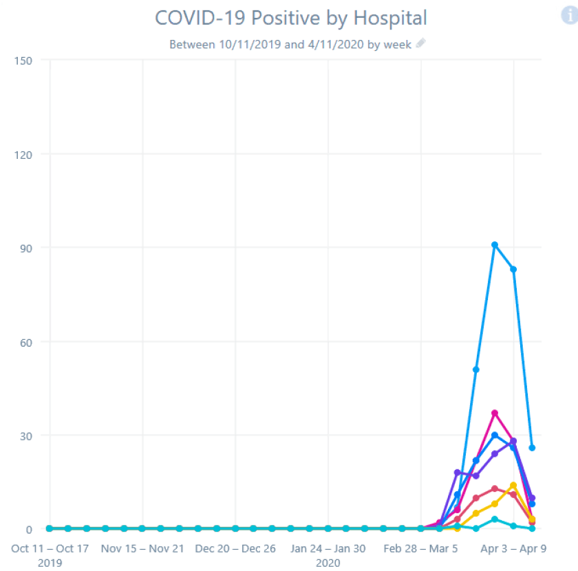
DATA SET 3: COMPARE ONE REGION’S SYMPTOMS VS HOSPITALIZATIONS
One more exploration: could chief complaints (Cough, Fever, Shortness of Breath) of patients presenting to clinics BY REGION possibly explain an increase in Covid+ patients a few weeks later BY REGION? Perhaps use the data as an early-warning signal for hospitals that a Surge is coming, that the curve is about to go exponential? A leading indicator and not a trailing indicator?
Here’s Chief Complaint in Denver Metro (percent of visits):

Here’s Chief Complaint in Denver Metro (actual visits):

Here’s hospital admissions for Covid+, Denver Metro:

What is your analysis? Make up your mind … then scroll on.
CONCLUSION 3: I see the “percentage” of complaints start growing steeply on Feb 21. I see the hospitalizations start to rise Mar 13, about 4 weeks later. I see “actual count” of complaints peak and decline after Mar 13. I see hospitalizations peak and decline Mar 27, about 2 weeks later. We Found a Signal!
Danger, Will Robinson!
This is post-hoc data analysis at its best, looking back at the data in hindsight and saying “Of course I was right all along.” It fits a good story, infection rising in the community and the sickest showing up about 4 weeks later, infection falling in the community, and Covid-19 admission cases falling a couple weeks later. Maybe there is some truth here.
However, looking at data and graphs from another region, the Fever/Cough/Shortness of breath curve stays mostly flat, and yet the Covid-19 hospitalization bumps same time as Denver.


Go figure.
I hope this jaunt through the data gets you interested in thinking about data, in seeking patterns, in questioning your findings, in considering viral behavior, disease behavior, human behavior, health system behavior, government behavior.
And, we are thankful that our infection rate, our hospital capacity, our leaders in Colorado, our government/business/public health/health system/community leader relationships are strong and can work well together.
CMIO’s take? Data analysis is hard. Sometimes you find signal. Sometimes you find noise. Sometimes you mistake the one for the other. Armchair theorists and even amateur data dilettantes (including some enthusiastic CMIO’s) should be careful.
This is awesome. Thanks for breaking down the data, very interesting to see how looking at the same information in a different way can lead to very different conclusions. Very cool and very appreciated.